Quite often budgets don’t allow you to use a designer for your website or business cards but, as we all know, first impressions count. Understanding fonts can help to give you a clean, clear style and help present you in a professional manner. Hopefully my blog post will help you feel a little more confident with your font choices.
Now this might sound crazy, but words are for more than just reading. The shape and appearance of a word can say as much as the word itself. The fonts used in a project should be easy to follow, attract your attention, and reaffirm the meaning and voice of the piece.
But there are just so many to choose from, how do you know what to choose, or if you are already using fonts, how do you know what you have works?
Comfy shoes
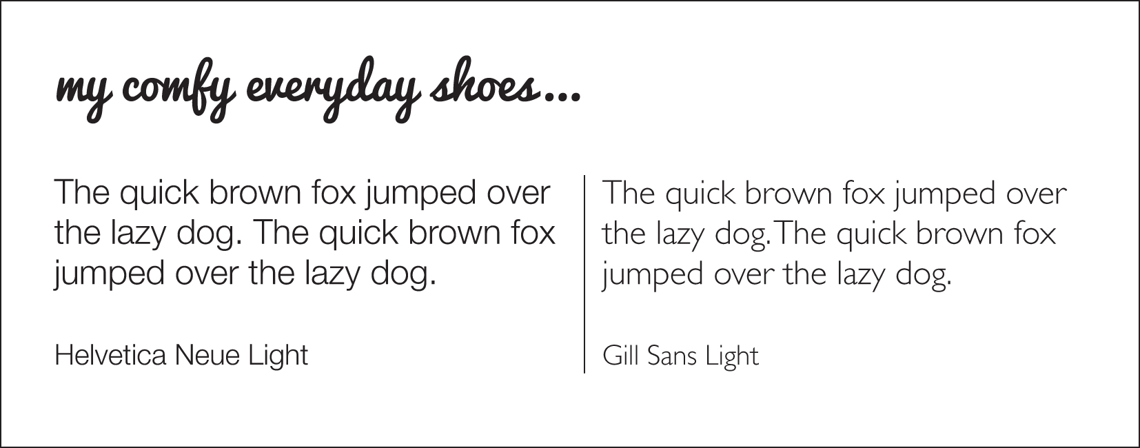
Each designer in my team has their personal everyday favourites, like your favourite comfy shoes that work for pretty much any occasion. They aren’t too high, too uncomfortable, or too weird a style, you can dress them up or down. Fonts can be the same.
I have a few everyday favs that I keep coming back to: Helvetica Neue, Akzidenz Grotesk and Gill Sans. (Finding out the font chosen for IOS7 was Helvetica Neue Light and Ultra Light made me pretty happy!)
My everyday choices come in a selection of different weights and styles (light, regular, bold, italic, condensed etc) so I can make things stand out in different ways without muddying the design. I do use lots of other fonts, but these ones just seem to crop up a lot in my designs!
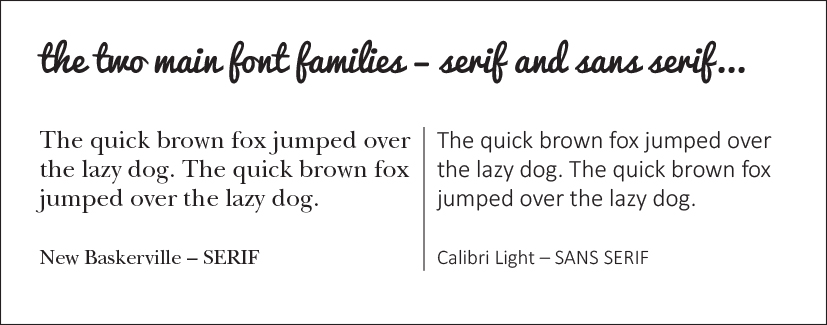
To help you find your perfect shoes in the font world, you need to first look at the font groups. There are two overall families that fonts belong to: Serif, and Sans-Serif. A Serif font has small “feet” on the letters. Times New Roman is a Serif font, and works well as body text, as the feet on the letters help your eyes to follow along the words.
A Sans-Serif font like Arial doesn’t have “feet”, and is a good headline font because it’s big and clear and calls out from a distance. There are further sub families, but you don’t need to get too involved with that.
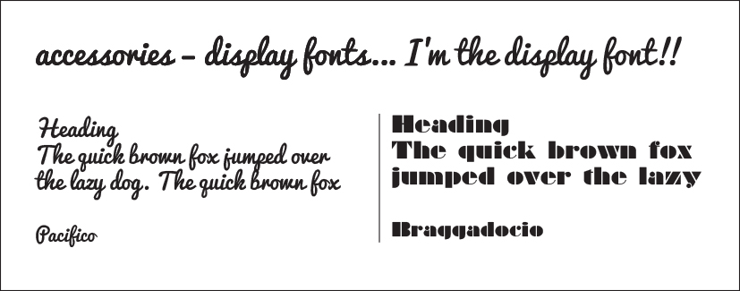
Adding accessories
To keep things simple you can keep a project to one font, and just use the different weights, but if you are going to add a second to the mix then it pays to go for something different and contrasting – don’t choose fonts that are virtually the same. So basically don’t mix two fonts like Akzidenz Grotesk and Gill Sans. If your headings are sans serif then think body text in a serif font and vice versa.
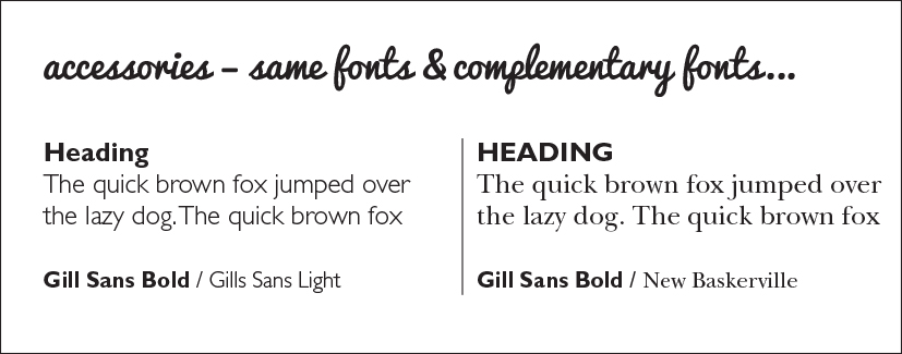
Here is the tricky bit – there is no real explanation as to why two fonts work together, they just do, they just complement each other. Quite often fonts that were created around about the same time in date work well together even if one is serif and one is sans serif, or if the proportions of the fonts are a visual match they will work well.
And then there are display fonts – think of the fonts used on movie posters, or on Thai menus. They are great to get a feel across, to emphasise personality, but if used for all the text it would be very difficult to read, and totally overpowering. These should be dusted lightly across any of your work, just as a little accessory to the design, like a stitch detail on your shoe.
When you are looking at a design, your eyes should be drawn through it in a way that provides you with the relevant information almost instantly, and that’s just what the fonts should help you do. That’s why it’s important to use fonts well.
Here are some quick rules:
- How many different fonts are used? If there are more than three, then the project is dangerously close to being labelled messy.
- The use of fonts should be purposeful. Fonts are often a great opportunity to add life.
- Use fonts that mix well with the message and tone.
- Try for the correct usage of Serif and Sans-Serif fonts.
- The font used ensures your eyes are naturally drawn to the most important or most interesting part.
- You are able to scan the piece and understand what it means, without having to backtrack or scrutinise it.
- The key information is easy to find, and easy to read.
- Avoid needless distracting overuse of display fonts on the page.
And finally…
Ignore all of the above! There are no rules! There are always examples of entire designs set with display fonts, or complete articles in two very similar sans serif fonts, that look amazing. The guidelines give you somewhere to start, but the main thing is that good layout with fonts is carefully engineered for usability and readability and will be easy to interact with. Sometimes it is intuition or emotion that lets us know that something works, good classic fonts used well by someone who understands how to use them will always work.
Find your everyday comfortable fonts and stick with them for a while, see how it feels, and then you can experiment a little more with some accessories in the way of display fonts. If you do this you will build your own signature style and be happy in your own visual skin.
If you would like any help with fonts, always get in touch, I love to talk typography!!
Happy designing,
Nicola Fisher is Creative Director at The Creative Haus.
PS do you know anyone who would benefit from these tips? Then please do ask them to sign up for my newsletter.